Commissions As Big Elephants
Email/Social campaign
B2B
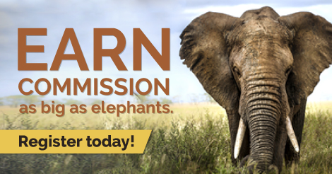
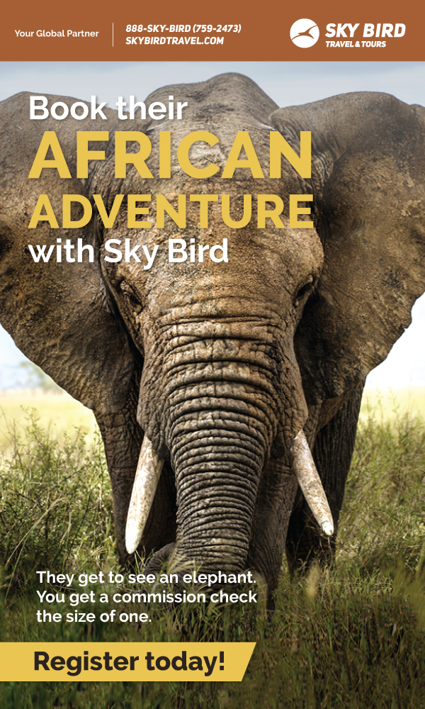
This email and social graphic are part of a large dual promotion we ran with the intention of selling travel to a specific region as well as encouraging new travel agents to register with us. My goal here was to find a connection between the destination and hooking new agents, which is where the of using the concept of an elephant came from. I wanted to create a memorable ad with a bit of levity, and I believe I accomplished this. I received many compliments from members of the organization.
Rocket Science
Email flyer
B2B
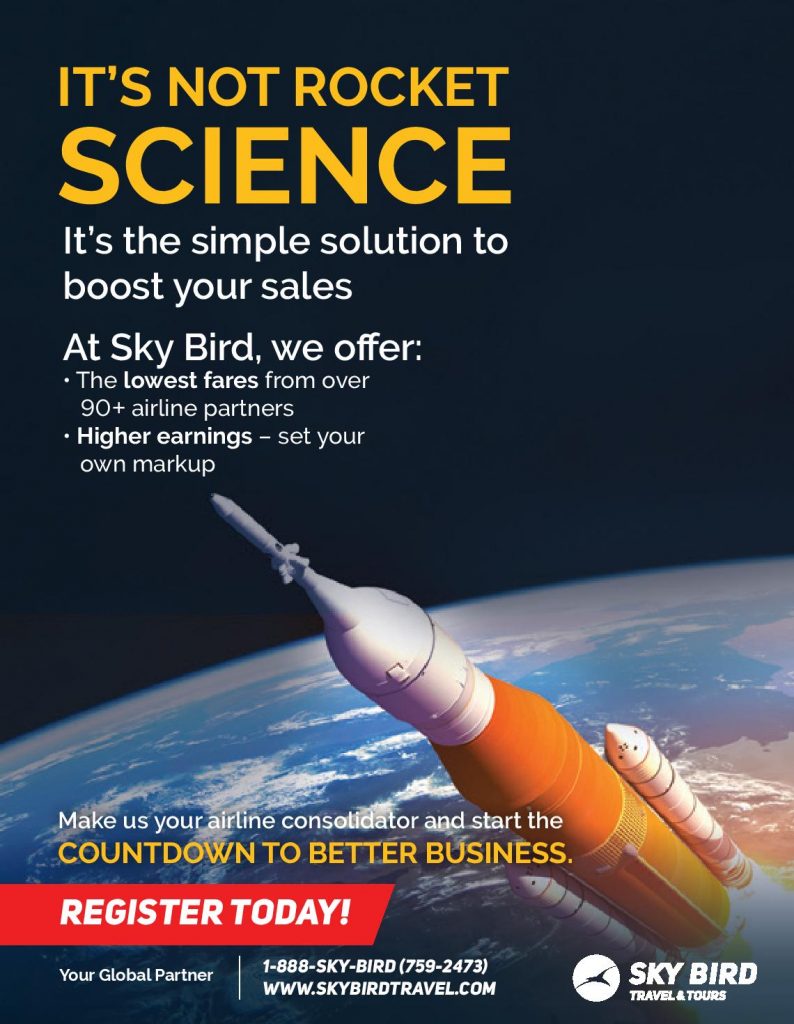
Like the “Forumula for Success” and “Transparent Booking” emails, this is another example of always striving for a clever means of conveying why travel agents should use our services. Putting myself in the mind of a travel agent who is looking to improve their business, I focused on what I believe would be the most enticing factor: setting your own markup. Many agencies have “commission caps,” meaning agents can only earn so much per sale of airfare. Sky Bird does not have this limitation. To me, a non-agent, it seemed quite simple that an agent could boost their earnings with us. In brainstorming the idea for this ad, I was reminded of the idiom about rocket science and decided to run with it.
Transparent Booking
B2B
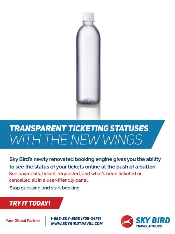
Sky Bird had recently updated their booking engine. The strategy here was two-fold: 1) Entice new agents to register with us 2) Reignite interest in travel agents who might have signed up with us and stopped using our services. While working with different departments to understand the nuances of the updates, I discovered a common theme: transparencey. Previously, agents had a difficult time knowing the status of clients’ tickets. The updates made everything more streamlined and user-friendly. I wanted to convey this concept in a clever way, which resulted in the email you see here.
Business Class Airfare Flowchart
B2B
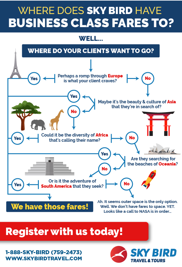
This is the final version of what began as a very basic flow chart. I quickly realized I had an opportunity to make this information more engaging. I worked with the designer to add some levity and produce the final product you see here.
